HORIZONTAL LINES (FREQUENCY LINES)
On the left of the chart you see the following figure:
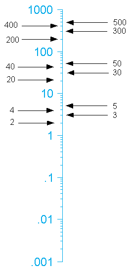
This figure, and each corresponding line tells the frequency in terms of how many in one minute (Before we go further I do want to say that this does not mean we can only display behaviors that occur in one-minute. In fact we can display behaviors that occur as little as one per day or as many times as 1000 per minute!). Back to the explanation of the figure. The 1 means one per minute. The next line up shows 2, and it proceeds up to 10. Now something happens which does follow normal conventions for those of you used to charting behavior on convention equal interval (or add/subtract) graphs. The next line up from 10 changes into 20 (not 11 as typical in equal interval charts).
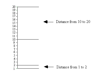
You will find from the 20 line goes to 30, 40 and so on up until 100. You probably saw this coming as well, the line after the 100 doesn’t show 101 but 200. The multiply divide scale shows behavior change proportionally. In other words the distance from 1 to 2 covers the same distance as 10 to 20. Notice the difference in the horizontal axes in the figures.
Equal-interval, or add-subtract, line graphs draw their name from their axes. The progression on both the vertical and horizontal axes change in equal intervals (when you move forward to the next interval the number grows by arithmetical progression +1 or +5 or +10, whatever the graph maker decides). The following graphic show a typical equal interval chart.

When using equal/interval charts the data can give a false impression of either rapid or minimal growth. However recharting the same data on a standard celeration chart and an opposite picture may emerge. This happens because equal/interval charts show change in an arithmetical and absolute fashion. The standard celeration chart shows change in a multiplicative and proportional manner. Therefore making judgments on equal/interval charts, which by the way almost always appear NON-standard, charters set themselves up for navigating behavioral waters without the best compass. A very good source for understanding some of the problems of using an equal interval chart appears in an article by Kubina, Eshleman, and Morgenstern. (If you want a copy of this article please send me an email request and I will snail-mail you one).
Now that you understand day lines and frequency lines, the time has come to tell you what goes on those lines that make the wildly effective standard celeration chart. Knowing three symbols will allow you to begin charting any behavior you desire. The three symbols follow:
X
–
What does these three symbols mean?
Very briefly:
- = acceleration data (behavior you want to occur more frequently)
X = deceleration data (behavior you want to occur less frequently)
– = counting time
You use the dot (•) when you want to represent a behavior targeted for acceleration (or stated differently, something you want to happen more). For example, let’s say I want my class of second graders to learn their addition facts to fluent levels. On the chart I will use dots (•) to show correctly answered addition facts. The beauty of using standard conventions? You can look at anyone’s chart in the world and if they have followed the precision teaching conventions you will know those dots (•) represent something the person doing the chart wants to accelerate.
I bet you fully understand what the X’s mean. Right, behaviors we want decelerated. In the addition fact example we just used, the X’s would represent the number of addition facts the student answered in correctly. Let’s waste no time and learn how to put these two pieces of information on the chart. This example will help. Today we gave a practice sheet of addition problems (single digit problems with sum’s of 0 to 18 with no carrying) to our young student Rick. We gave Rick one-minute to answer as many problems as he could. When Rick finished our bright young man answered 23 correct and 4 incorrect (or had four “learning opportunities” as we like to call them in precision teaching). We need to do two things to graph corrects and incorrect on the chart. We must find what day this happened and then chart the corrects and incorrect on the appropriate day. Now I will illustrate how to do this just by using a cross section of the chart. Remember that dark lines show Sundays. So if we say Rick got his 23 correct and 4 incorrect answers (on the addition practice sheet) on Thursday we need to: (1) locate Thursday; (2) find where 23 corrects lays on the charts and plot that; and (3) find where 4 incorrect lies and plot that. Please look below to see how I did this with a cross section of the standard celeration chart.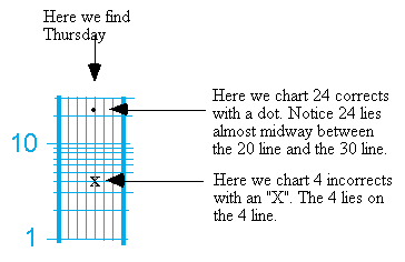
Let’s keep going with this example. On Friday Rick got 21 correct and 3 incorrect. Saturday saw Rick getting 28 correct with only 1 incorrect. Look below and see how we find each day and chart each data point.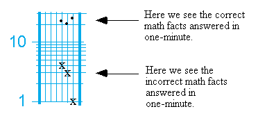
You must remember something else when finding the day. Where does your chart begin. Remember the “synch-date?” Whether you use synch-dates or just start the Sunday beforehand (personal usage) you must set up your chart accordingly to figure out where the day (more specifically the date of the day) goes so you can put the dots and X’s in the correct place.
Later we will talk about how to measure the correct and incorrect responses over time to come up with a “celeration.” We will see that we can put a number on weekly learning (like x 2 or x 3.4 – said “times 2 or time 3.4”). Imagine that, we can actually numerically determine how much learning our teaching produces! You will not find celeration or such sensitive measures of skilled performances in any other measurement system. we might call precision teaching the sine qua non of tools for producing masterful learning (you can tell how much I love this stuff!).
Back to charting. I did mention that you must know three symbols to chart. Recall we use dots (•) for behaviors we want accelerate and X’s for behaviors we want to decelerate. The other symbol, a dash (-) stands for the counting time. A “record floor?” What the heck does that mean? Good question. A record floor represents the time period you observed, or measured a behavior. If you think about the term “record floor” you can almost figure out what it means.
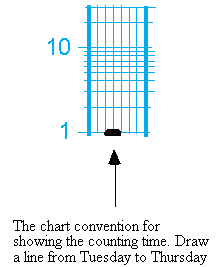
Before we discuss the convention for using counting times please allow me to explain how to find where the counting time goes. The standard celeration chart has the ability to show behaviors that occur as little as once a day (24 hour counting time) or a thousand times per minute (one-minute counting time). If you have a copy of the daily standard celeration chart (Dpmin-11EC) you will notice on the right hand side a key that says “COUNTING TIMES.” Then below that you see how the seconds and minutes, and hours appear on the chart. The following figure shows how to find the counting times (or what will become the place for our counting times).
Calendar Charts (PDF file)
I would like to direct your attention to the arrow that points to one minute. You will notice this line appears at the center of the chart. If all you did involved conducting one-minute timings you could use the counting time, and chart, relatively easily. Let’s go back to our previous example to illustrate. Recall we had Rick doing addition facts in one-minute. Thus our counting time for that period equaled one-minute. We know how to write the corrects and incorrects convention (dots and X’s). Now I will share with you the special convention for showing counting time: we draw a dashed line from Tuesday to Thursday in the middle of the week. Please look below for the convention.
When we use this convention for one-minute showing the frequency becomes easy. Every frequency line (horizontal line) equals the frequency shown to the left. To illustrate this I plot 1 through 7 below (I will use dots for this example).
For any other record floor you would follow the same convention and place a line from the Tuesday to : Thursday for the specific time. Note on the chart with the arrows I have written in the time to the right and the frequency line to the right. To display a number simply multiply the number to the right by the corrects or incorrects and then place the corresponding number on the chart. For example look at the figure below.
Conclusion
This supplement forms but the beginning to standard celeration charting and precision teaching. Nevertheless with this supplement your beginnings should provide you with the skills to find you way around the chart and to begin to measure/display data and make decisions. As the old precision teaching slogan goes “Care enough to chart!”
References
Bates, S., & Bates, D. F. (1971). “…and a child shall lead them”: Stephanie’s chart story. Teaching Exceptional Children, 3(3), 111-113.
Binder, C. (1996). Behavioral fluency: Evolution of a new paradigm. The Behavior Analyst, 19, 163-197.
Kubina, R. M., Eshleman, J. W., & Morgenstern, B. (2000). Graphic display and the Standard Celeration Chart. Manuscript in preparation.
Kubina, R. M., Haertel, W., & Cooper, J. O. (1994). Reducing negative thoughts and feelings of senior citizens: The one-minute counting procedure. The Journal of Precision Teaching, 11(2), 28-35.
Lindsley, O. R. (1992). Precision teaching: Discoveries and effects. Journal of Applied Behavior Analysis, 25, 51-57.
Lindsley, O. R. (1993). Our discoveries over 28 years. Journal of Precision Teaching, 10, 11-13.
Maloney, M. (1998). Teach your children well: A solution to some of North America’s educational problems. Cambridge, MA: Cambridge Center for Behavioral Studies.
McGreevy, P. (1983). Teaching and learning in plain English (2nd ed.). Kansas City, MO: Plain English Publications.
Pennypacker, H. S., Koenig, C. H., & Lindsley, O. R. (1972). Handbook of the standard celeration chart. Kansas City, MO: Precision Media.
Potts, L., Eshleman, J. W., & Cooper, J. O. (1993). Ogden R. Lindsley and the historical development of precision teaching. The Behavior Analyst, 16(2), 177-189.
White, O. R. (1986). Precision teaching-Precision learning. Exceptional Children, 52(6), 522-534.
White, O. R., & Haring, N. G. (1980). Exceptional teaching (2nd ed.). Columbus, OH: Merrill.